


Business-Commercial Retouching
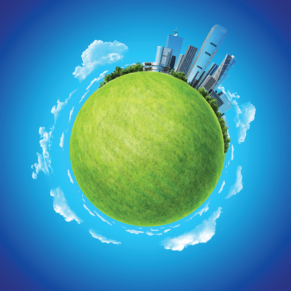
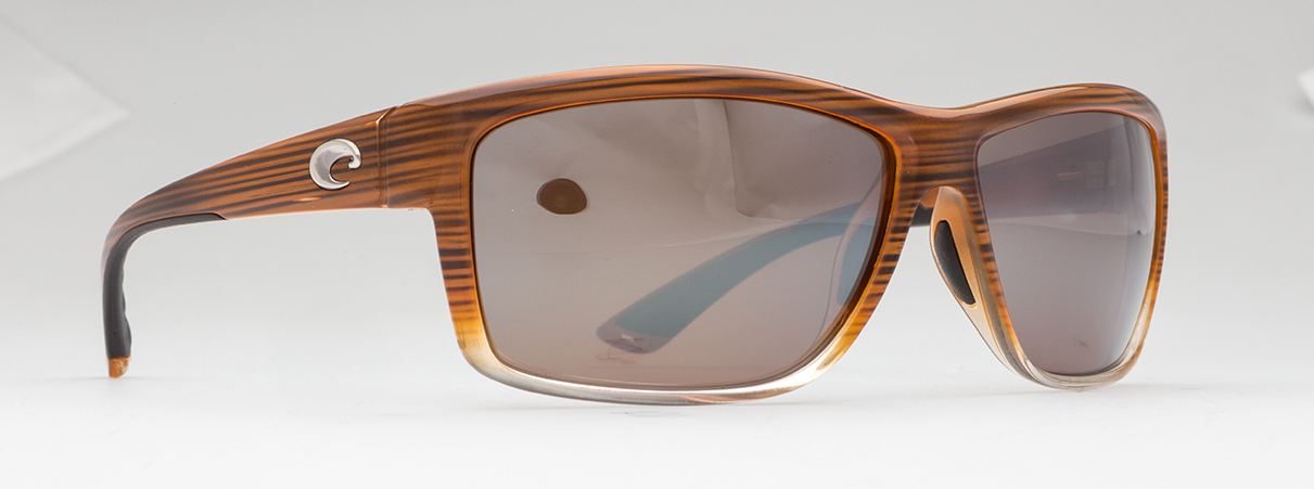
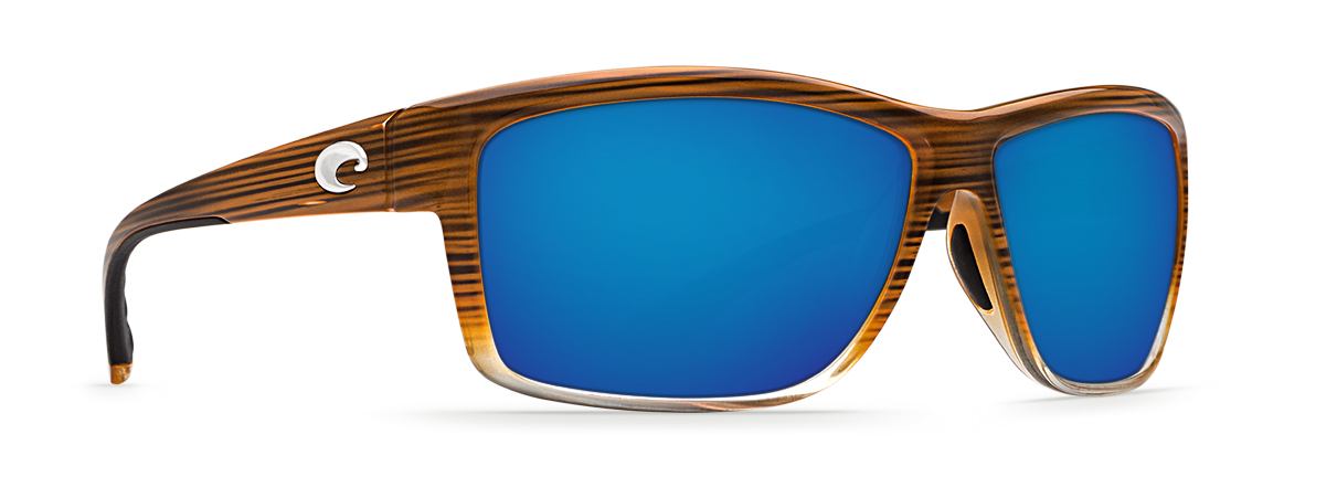
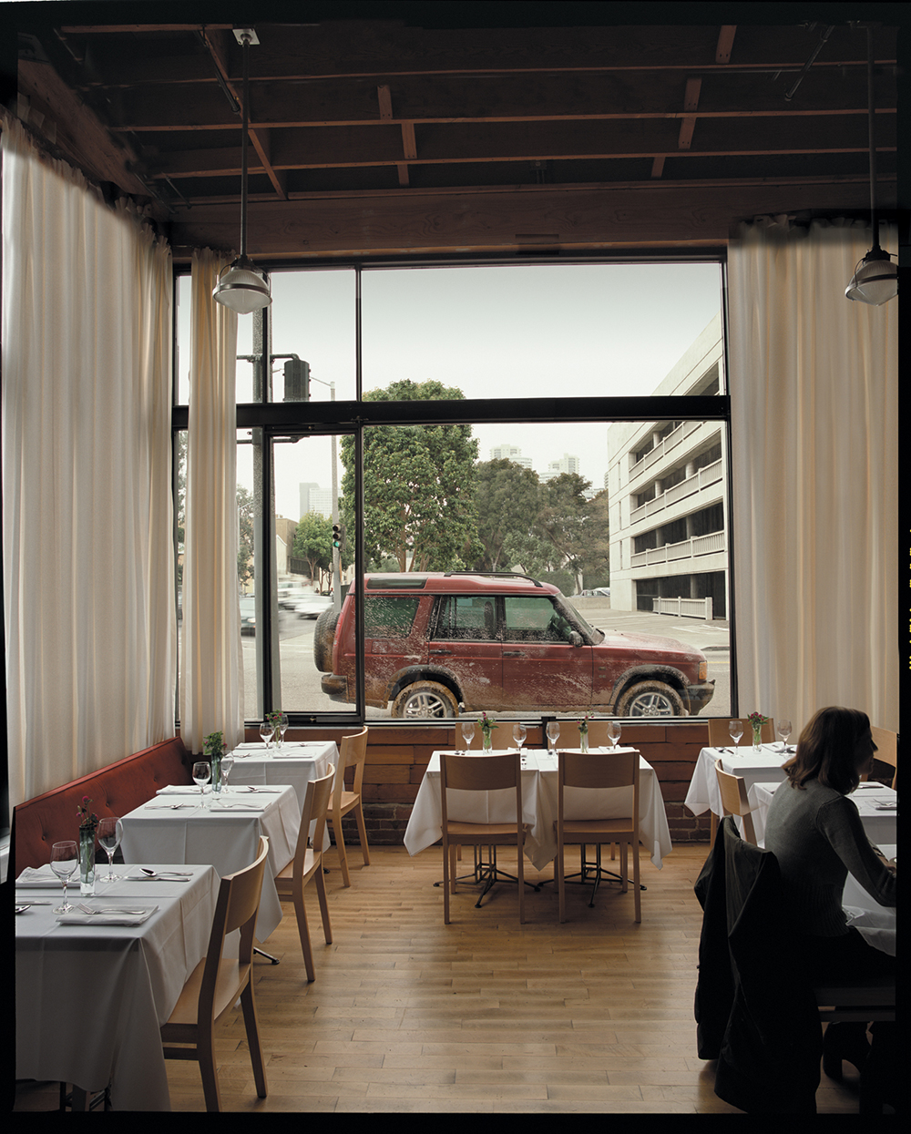
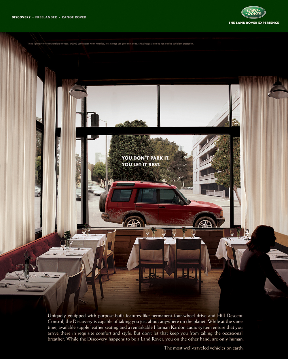
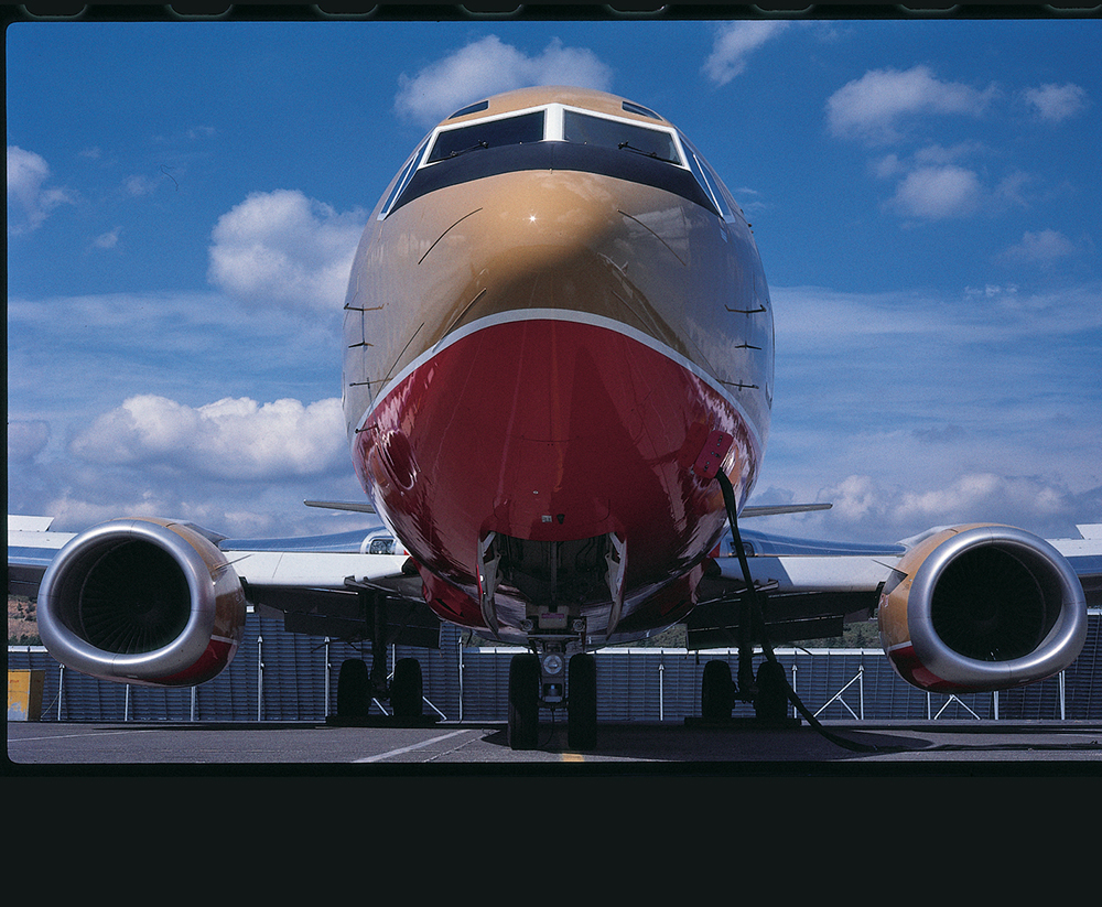
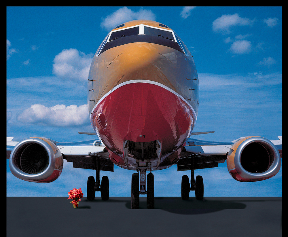
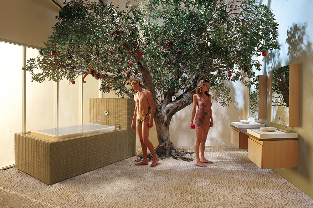
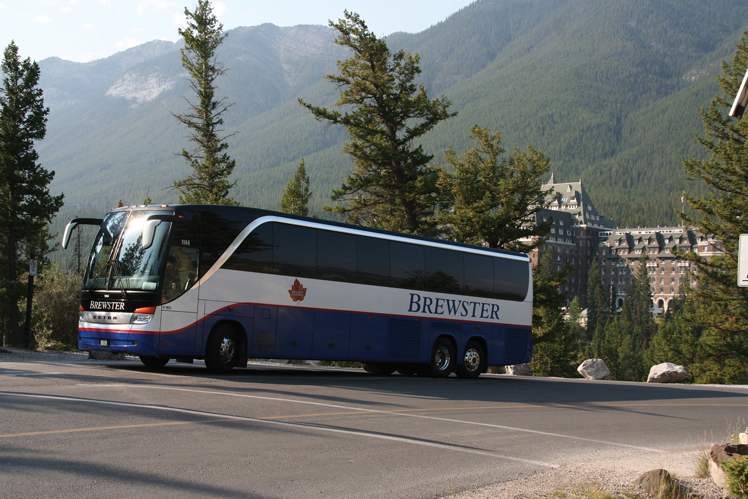
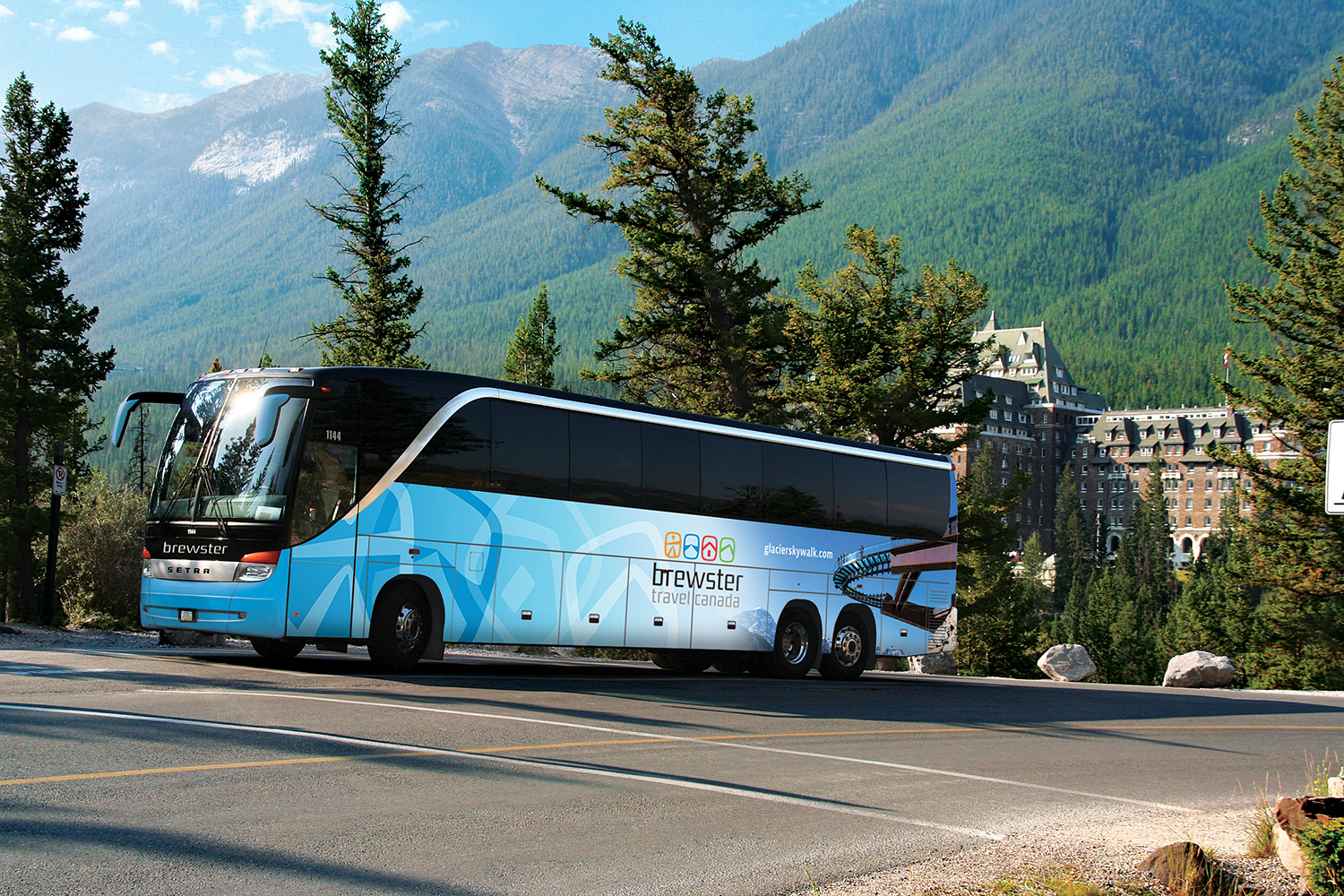
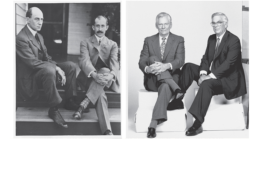
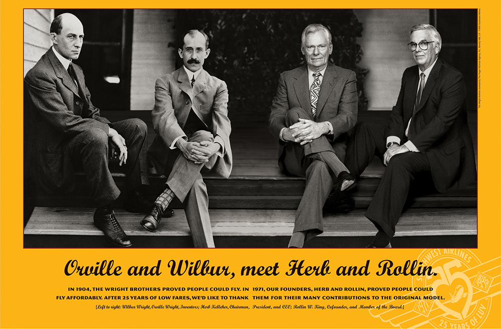
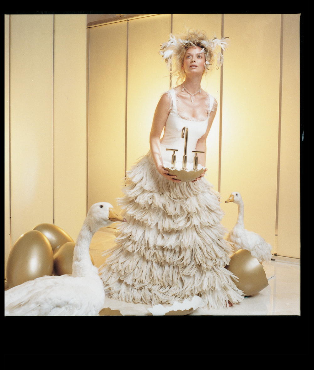
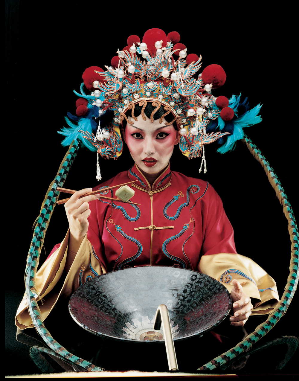
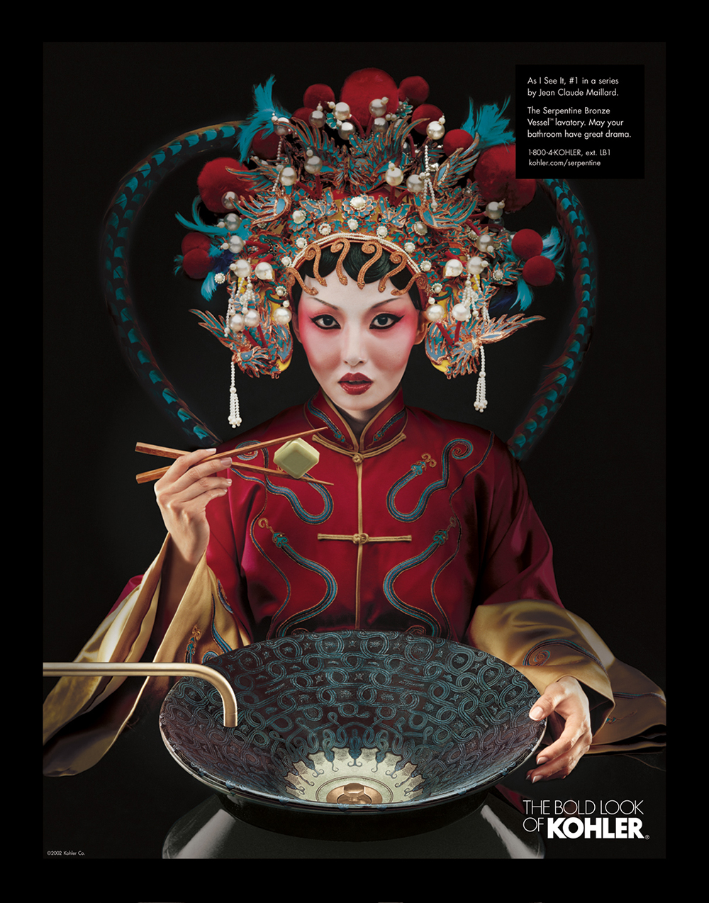
Business & commercial retouching services for your company’s print and web based advertising projects. Above are a handful of sets of original, unedited images , followed by it’s retouched, final version of the same image. For up close, detailed viewing, you may select any image and view on it’s own page, where you can zoom in to see some of the subtle, yet revealing changes compared to the matching original. Look closely to see changes in skin tone, smoothness of skin, and lack of “graininess” which may be present in original, but not in the edited final image. One of the many goals in creating a stunning advertisement is to some how make the image stand out, or even jump out at the viewer, whether it’s on a website, a magazine page, or even a billboard. Always important are the 3 “C’s”: Color, Contrast, and Clarity. Colors must to be pleasing, natural, and in some instances, exact. If my client is selling a product, and that product is bright green, I must match that color exactly. And if this image will be printed in a magazine or catalog, I must know, and compensate for the imperfect process that printing on paper is. Great contrast is achieved when the lightest areas of the image are truly bright, and the darkest areas are as dark as possible, all while still visibly holding shape and definition. Finally, clarity is the sharpness of the entire image. It must be clear and precise, easily viewed……not blurred. There is a fine line between a sharp, in focus image and a too sharpened, unnatural, unrealistic, and even possibly “pixelized” image. This is a line to never cross. If I can create an image that excels in these 3 factors, it will most likely please the client and their customers.